
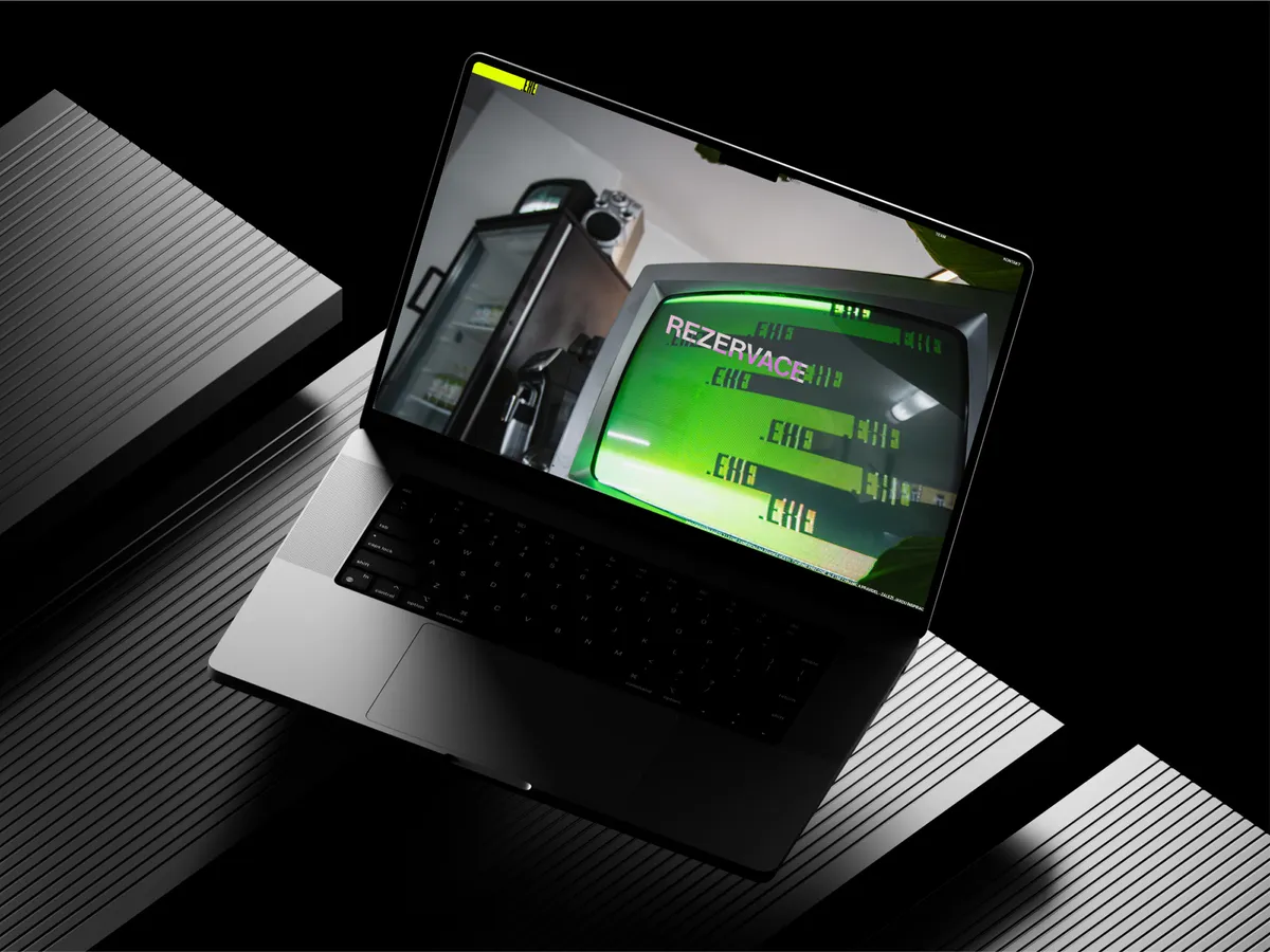
Salon .EXE
A one-page site for the men’s salon .EXE in Prague 7. The design arrived finished from the client and does not care much for the usual rules: headlines run past the edge, large empty areas sit between sections, and the gift vouchers boot up like DOS. We built it the way it was drawn and added an admin where the barbers can rewrite the price list between two customers.
The Challenge
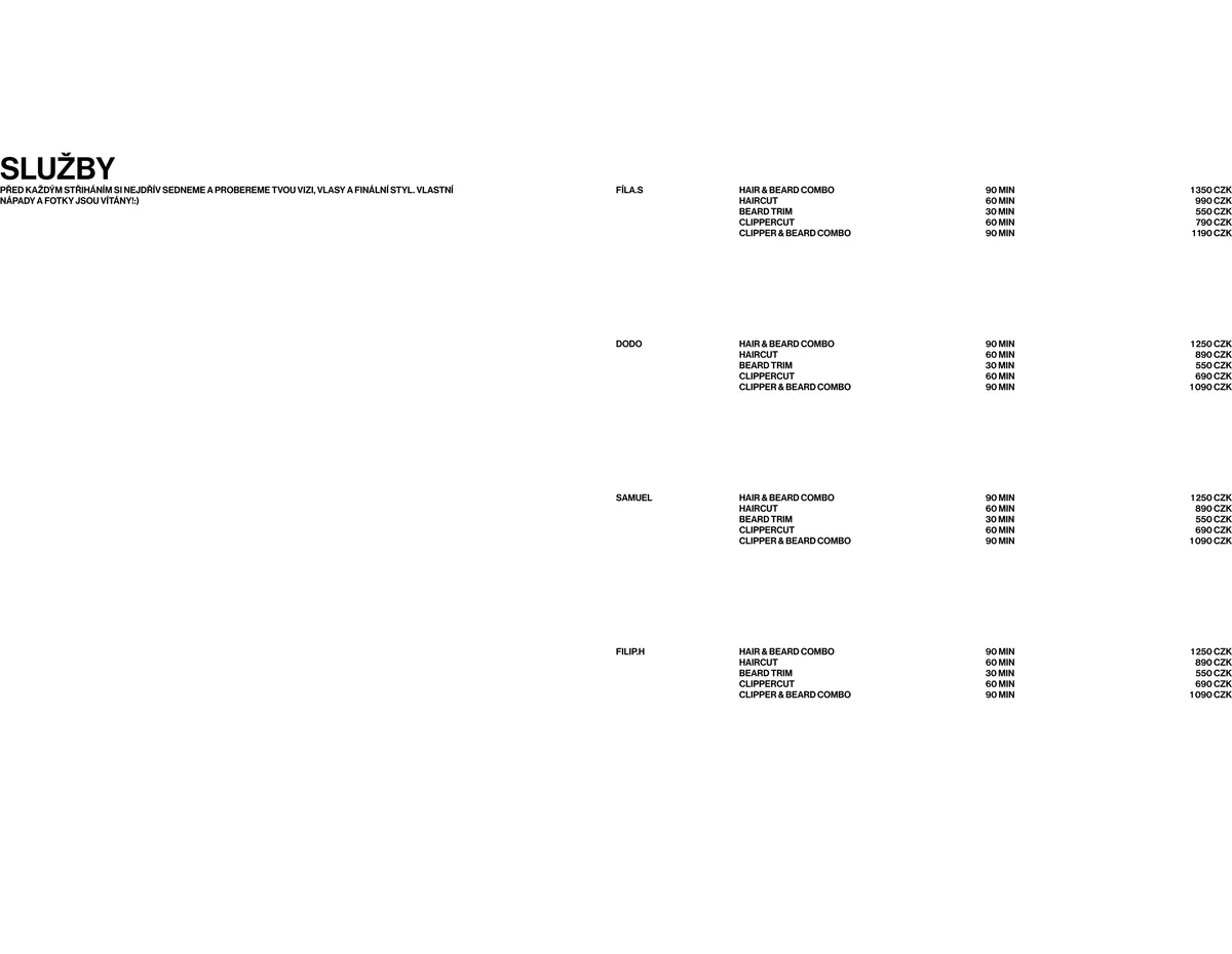
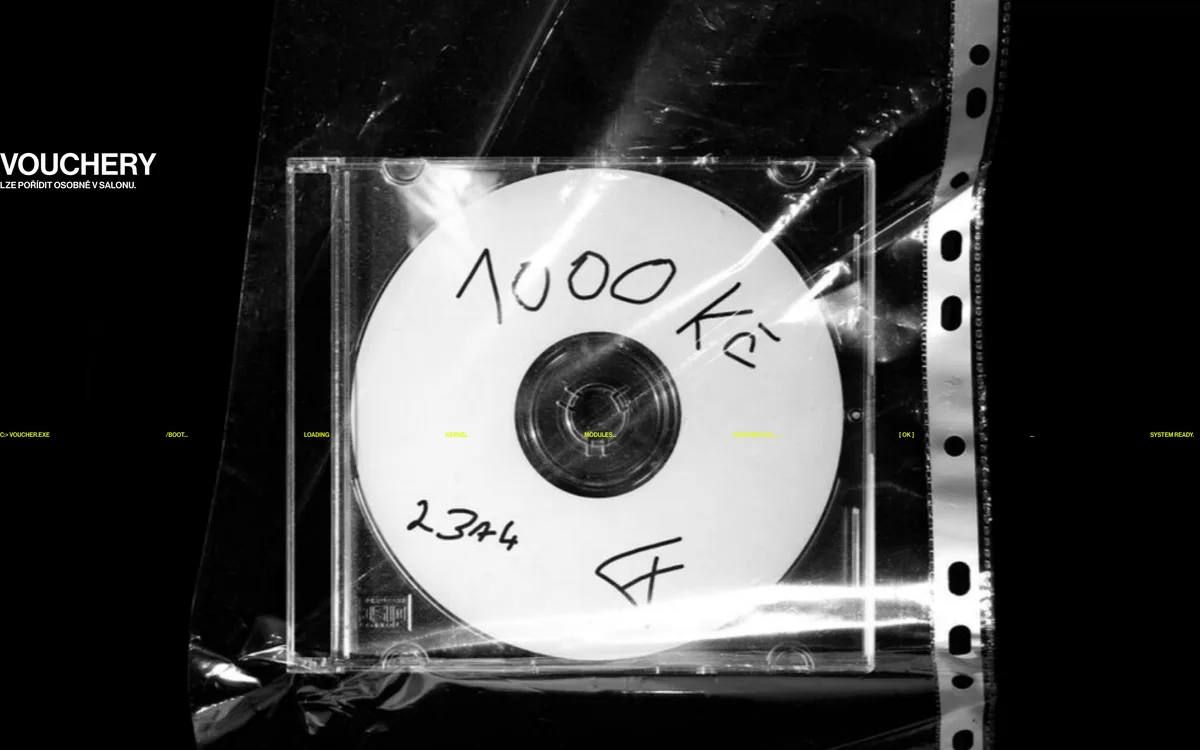
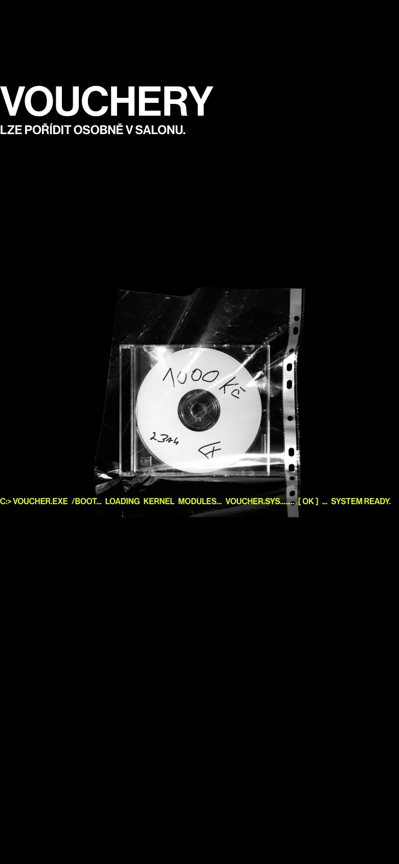
The design came to us finished, from the client, Filip Slovacek, and it looks like nothing we would have drawn ourselves. No grid, no cards. The Services headline sits alone in the top left of an otherwise empty screen, four price lists are pushed out to the right edge, and there is nothing in between. The voucher section is black, with a photographed burned CD and a boot message in acid yellow. The comfortable move would have been to flatten it into a standard barbershop template, but then it would have been one more barbershop site. The second half of the brief was more mundane: four barbers maintain the page between customers. Each has his own price list, the line-up changes, and none of them is going to email an agency over a price.
Our Solution
- Built a custom WordPress theme from scratch. A layout that ignores the grid will not come out of a page builder.
- Took the design as given. Including the logo that is deliberately cropped by the corner, and the empty areas that make you wonder for a second whether the page finished loading.
- Wrote the voucher boot sequence by hand, no library. It types out character by character like an old terminal and lands on System ready.
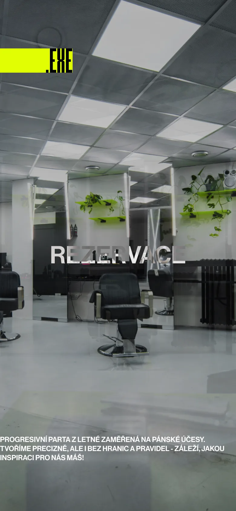
- Replanted the layout for phones rather than shrinking it. The logo fits whole, the price lists stack, and the big desktop gestures survive 390 pixels.
- Made every section its own block in the admin with its own fields. Whoever edits the site sees neither code nor theme settings, only the fields that concern them.
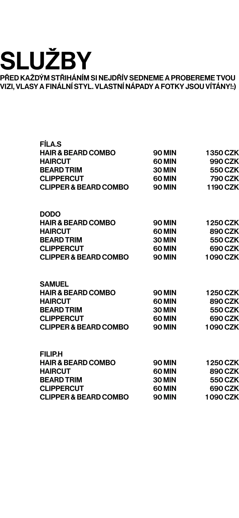
- Gave each barber his own price list. Changing a price or a duration, or adding a service, is one row in the admin.
- Left the booking alone. The salon was already on Noona, so the button points there and appointments stayed where the team was used to them.
- Ran the whole site on one JavaScript file, no jQuery and no framework. The font is self-hosted and preloaded so the headlines do not jump on open.
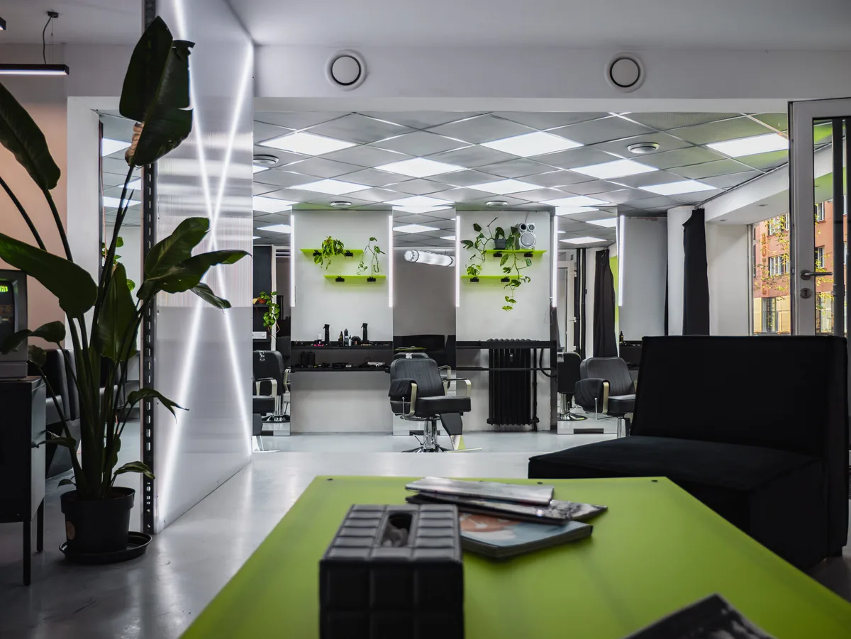
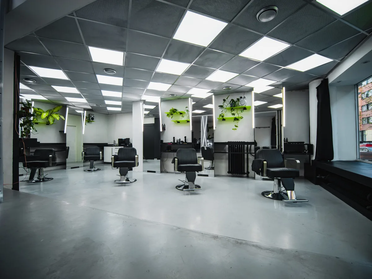
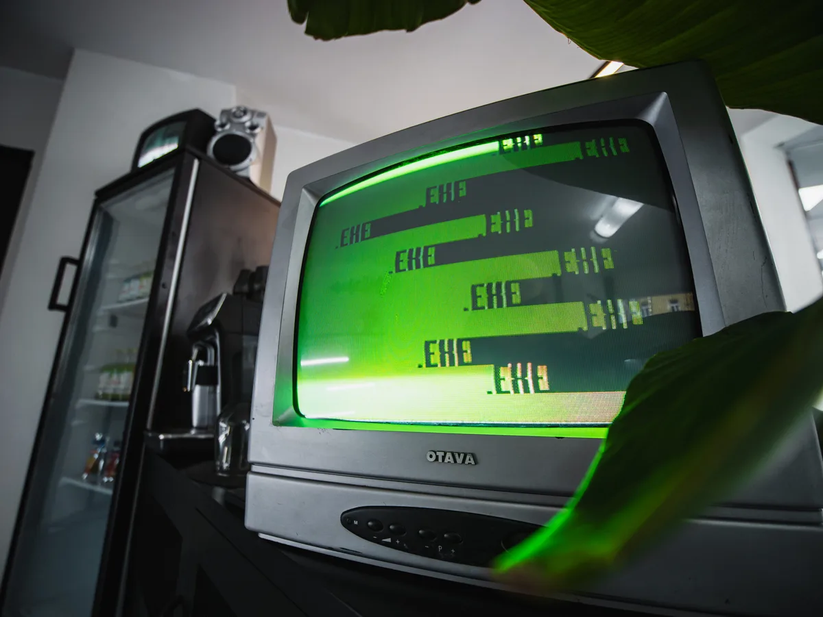
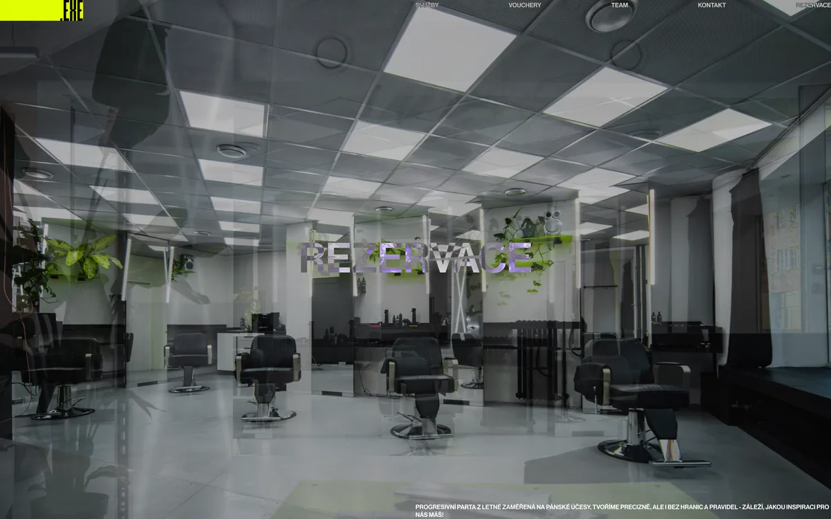
- Used photos from the shoot the salon did themselves. Four of them crossfade across the full opening screen.
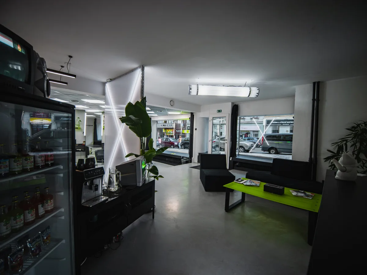
The salon in Letná
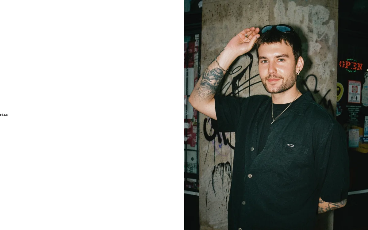
The photos come from a shoot the salon did themselves, a few steps from the Kamenická tram stop. Four of them crossfade across the opening screen.
The site
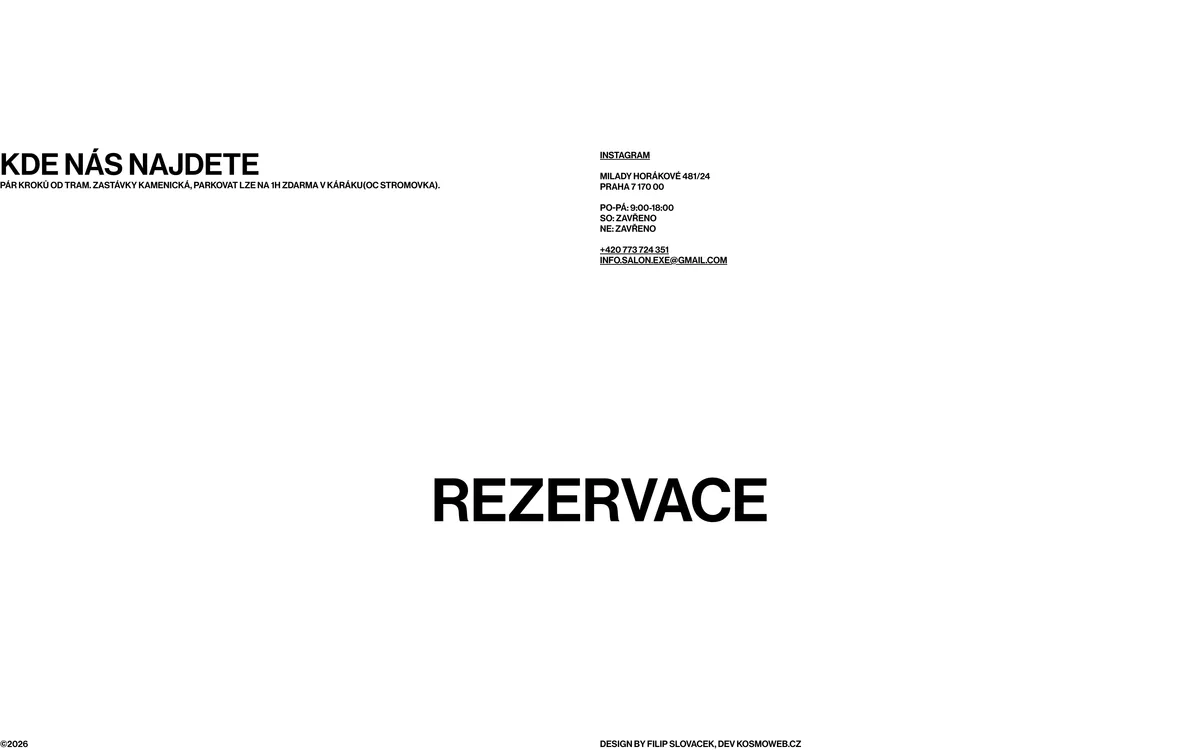
One page, five sections. What reads as a typesetting mistake in these shots is deliberate, straight from the client’s design.
On a phone
Typesetting that rests on large empty areas does not collapse into one column by itself. Each section was replanted separately for phones.
What We Delivered
The client’s design built without changes
Custom WordPress theme, no page builder
Four separate price lists the salon edits itself
Boot animation on the gift vouchers
Booking through Noona, left as it was
A mobile version that kept its character
One JavaScript file, no jQuery