
Before a visitor reads a word of your copy, they have formed an impression based on the colors they see. That impression happens in milliseconds and influences whether they stay, explore, and convert. Color palette selection is a strategic decision, not a decorative one.
A few years ago, we worked on a boutique architecture firm whose website used a palette of muted grays and beige. Elegant but lifeless. Session duration was under 40 seconds; the portfolio page had a bounce rate above 70%. The firm’s work was strong, but the website was not giving visitors a reason to look. The palette needed energy without losing sophistication.
Why color choices matter
Color psychology is real. Warm tones create urgency and excitement — that is why they dominate clearance sales and CTAs. Cool tones convey calm and reliability, which is why they dominate healthcare, finance, and technology. But these effects are not universal. Cultural context matters: white means purity in many Western markets and mourning in parts of East Asia. Red means danger in one context and prosperity in another. For clients with international audiences, we research color associations in their target markets before finalizing anything.
Beyond emotional response, color affects usability directly. Contrast ratios determine whether text is readable. Color-coded navigation can speed up orientation or create confusion depending on execution. The relationship between background, text, and accent colors establishes a visual hierarchy that guides the eye. Get it right and users move through your pages naturally. Get it wrong and they struggle to find what they need.
Picking the right palette
Choosing a color palette starts with understanding your brand identity and your audience. A children's educational platform and a corporate law firm should not share the same color approach, even if the same designer builds both. We begin every palette project with a discovery session that covers brand values, competitor analysis, audience demographics, and the emotional response the client wants to evoke.
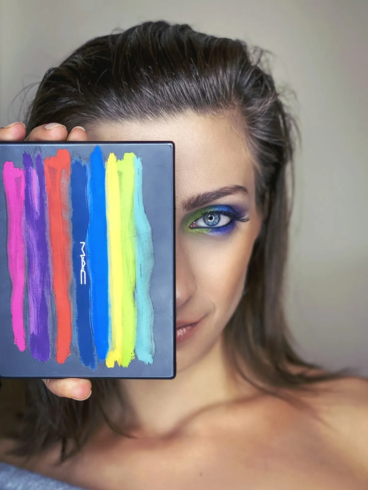
From there, we typically build a palette with five to seven colors: a primary brand color, a secondary accent, a neutral base (usually a shade of gray or off-white), a text color, and one or two functional colors for success states, errors, and warnings. The 60-30-10 rule serves as a reliable starting point: 60% dominant color (usually the neutral base), 30% secondary color, and 10% accent.
Tools like Adobe Color, Coolors, and direct extraction from photography or art that resonates with the brand are all part of our process. But tools only generate options. The real work is testing those options in context, on actual page layouts, with real content, across devices with different screen calibrations.
Testing your choices
We never finalize a palette based on how it looks in a design file. Screens vary wildly. A color that looks rich and saturated on a designer's calibrated monitor can appear washed out on a budget laptop or overly vivid on a high-end phone. We test palette candidates across at least five devices before committing.
Accessibility testing is non-negotiable. We check every text-and-background combination against WCAG 2.1 contrast requirements. This is not just about compliance; roughly 8% of men and 0.5% of women have some form of color vision deficiency. If your call-to-action button relies solely on a red-green distinction, a meaningful portion of your audience may not perceive it as intended.
We also run preference tests with target audience samples when the project budget allows. Showing users two or three palette variations and measuring both stated preference and behavioral metrics (like which version they spend more time exploring) gives us data to support what might otherwise be a subjective decision. For a hospitality client, this testing revealed that their preferred deep navy palette actually felt "cold" to their target demographic of vacationing families, who responded much more warmly to a palette anchored in teal and sand.
What actually changed
Returning to that architecture firm: we replaced the gray-beige palette with a scheme built around charcoal, warm white, and a bold terracotta accent. The terracotta was used sparingly, on hover states, portfolio image borders, and the primary call-to-action button. The effect was transformative. The site suddenly felt alive, and the warm accent drew the eye exactly where we wanted it. Session duration on the portfolio page doubled within the first three weeks, and inquiries through the contact form increased by 27% that quarter.

Another example involved an online language learning platform. Their original palette used a bright, almost neon green that tested well for attention but poorly for sustained reading. Students spending 30 or more minutes on lesson pages reported eye fatigue. We shifted the green to a softer, more muted tone and introduced a warm off-white background instead of pure white. User-reported comfort improved significantly, and average lesson completion rates rose by 14%.
These are not coincidences. Color directly affects how long people are willing to stay on your site and how they feel while they are there. When the palette supports the content rather than competing with it, engagement follows naturally.
What not to do
The most common mistake we encounter is using too many colors. When everything is highlighted, nothing stands out. We have audited sites that use eight or nine distinct colors with no clear hierarchy, creating a visual experience that feels chaotic and untrustworthy. If your palette needs more than seven colors including functional states, it is probably time to simplify.
Another frequent error is neglecting dark mode. An increasing number of users browse with dark mode enabled on their devices, and a website that looks polished in light mode can become an unreadable mess when the operating system inverts its colors. If you are not designing an explicit dark mode, at minimum ensure that your color choices do not break under system-level inversion.
Trend-chasing is also risky. Neon gradients and duotone overlays had their moment, but building a brand identity around a passing trend means your site will look dated within a year or two. We advise clients to keep their core palette timeless and reserve trendy color treatments for campaign-specific landing pages that have a shorter lifespan.
Final thoughts
Start with your brand values and audience, not with a color you personally like. Test in context, not in isolation. Prioritize contrast and readability over aesthetic preference. Use accent colors to create a clear visual hierarchy that guides users toward your most important actions. And revisit your palette periodically, because as your brand evolves, your colors should evolve with it.

At Kosmoweb, we approach color as one piece of a larger engagement strategy. A great palette amplifies great content, clear navigation, and thoughtful layout. It cannot compensate for poor structure, but when everything works together, the right colors make the difference between a website people glance at and one they remember.