
Last autumn, the marketing director of a mid-size Czech manufacturing company sat across from us in our Prague office and said something we hear often: "Our marketing isn't working anymore." They had been running the same ad spend, the same campaigns, targeting the same industries. Traffic was stable. But lead form submissions had dropped 40% over the past year, and nobody could explain why.
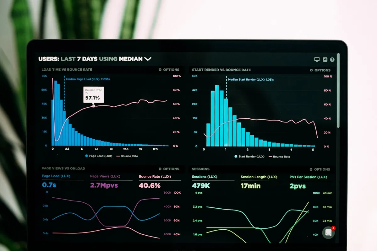
We spent two hours with their Google Analytics and Hotjar recordings. The answer wasn't in their marketing. It was in their website. The site had been built in 2020 on a WordPress theme with a page builder. It looked okay on a desktop monitor. On a phone, where 64% of their traffic now came from, the experience was painful. Forms were tiny. The hero image pushed the headline below the fold. Pages took over four seconds to load on a mobile connection. Users were arriving and leaving before they ever saw the value proposition.
They didn't need a new ad strategy. They needed a new website. But telling the difference between a necessary redesign and an expensive distraction is harder than it sounds. After eight-plus years of these conversations, we have opinions.
Sign 1: Your metrics are declining and you can't explain why
We see this one the most. Traffic holds steady or even grows, but conversion rates slide. Bounce rates creep up. Time on site drops. The marketing team tries new campaigns, tweaks ad copy, adjusts targeting. Nothing moves the needle.
When the traffic source is healthy but outcomes are declining, the website is usually the leak. Users are arriving with intent and leaving without acting. That gap between arrival and action is usually the website, not the campaign.
The tricky part is that these declines are gradual. A 2% drop in conversion rate per quarter doesn't trigger alarms. But compounded over two years, that's a 15% decline in leads from the same traffic. By the time someone notices, the damage is real.
One thing worth doing: compare conversion rates year over year, split by device. If desktop holds steady but mobile is falling, the site's mobile experience is likely the culprit. If both are declining, the problem may be broader: outdated design, slow performance, or messaging that no longer matches what your audience expects.
Sign 2: Your mobile experience is an afterthought
Responsive design was the standard answer in 2016. Make the site shrink to fit smaller screens and call it done. But responsive and mobile-optimized are not the same thing.
A responsive site that was designed desktop-first often has problems that only show up when you actually use it on a phone. Navigation buried behind a hamburger menu with six nesting levels. Tap targets you need a stylus to hit. Images that are technically resized but still weigh 2 MB because nobody set up responsive image serving. Forms with tiny input fields and dropdowns that fight the mobile keyboard.
We audited a logistics company's website last year where the desktop site was polished and professional. On mobile, the primary CTA button sat 2,400 pixels below the top of the page. Users had to scroll past a massive hero image, a company description, three trust badges, and a services grid before they found the button that said "Get a Quote." Mobile conversion was a third of desktop. The fix wasn't minor CSS adjustments. The entire page hierarchy needed rethinking for a thumb-driven, vertical-scrolling experience.
If most of your traffic is mobile and the site was designed desktop-first more than three years ago, there is money on the table.
Sign 3: Your tech stack is holding you back
This one creeps up on you. The site works. Pages load. Content publishes. But every time you want to add something new (a booking widget, a client portal, a multilingual version), the answer from your developer is either "that'll take three weeks" or "that's going to break the contact form."
Common symptoms: a WordPress installation with 40+ plugins where updating one breaks two others. A custom-built site from 2018 where the original developer left and nobody else understands the code. A page builder theme that makes simple content changes easy but anything beyond its templates impossible.
We took over maintenance of a real estate agency's website that ran on a custom PHP framework nobody else in Prague seemed to know. Adding a property filter, something that should take a day or two, required three weeks because the original architecture had no concept of client-side interactivity. Every interaction triggered a full page reload. The client had been living with this for years because "it works." It did work. It just couldn't grow.
Your tech works today. Fine. But can it handle what you will need in two years? If the honest answer is "probably, with enough workarounds," that is your answer.
Sign 4: Your brand has evolved but your site hasn't
Companies change. They add services, enter new markets, refine their positioning, update their visual identity. The website is supposed to reflect all of that. Often, it's the last thing that gets updated.

We see this frequently with companies that have gone through rebranding: new logo, new colors, updated messaging in their pitch decks and social media, but the website still carries the old identity. Or companies that started as a single-product business and now offer a full suite of services, but the homepage still reads like it did when they had one product.
People notice, even if they can't articulate it. A potential client sees your LinkedIn, then your proposal deck, then your website. If the website looks like a different company, there is a tiny hesitation before they fill out a form. That hesitation is enough.
A quick test: open your website and your latest sales presentation side by side. If they look like they belong to different companies, your site is overdue for an update.
Sign 5: Page speed is embarrassing
Run your site through Google PageSpeed Insights right now. If the mobile score is below 50, your site is actively losing you visitors. Below 30, it's a serious problem.
Users have been trained by fast sites. Google, Amazon, and Apple load in under a second. Your site doesn't need to match them, but it does need to load in under three seconds on a decent mobile connection. Every second beyond that costs you roughly 7% of conversions, according to data Google has published repeatedly.
We measured this directly for a Prague-based SaaS company. Their marketing site loaded in 5.8 seconds on mobile. After rebuilding the frontend in Nuxt with proper image optimization, code splitting, and static generation, load time dropped to 1.4 seconds. Demo request form submissions increased 28% in the first month. Same traffic, same offer, same form. Just a faster experience getting to it.
Sometimes speed problems can be fixed without a full redesign: image compression, caching, removing unused plugins. But if your site was built on a heavy page builder with embedded third-party scripts and unoptimized assets baked into the theme, optimization has a ceiling. At some point, patching is more expensive than rebuilding.
Sign 6: You're embarrassed to share the link
Least technical sign on this list. Probably the most honest one. When a founder or sales lead hesitates before including the website URL in an email to a prospect, that's data. When someone says "the site doesn't really represent us" during a pitch, that's a signal. When your team shares a Notion page or a PDF instead of linking to the website, the site is not doing its job.
We've had clients admit this only after we asked directly. They'd been compensating with great sales conversations and strong referrals, so the website's weakness was masked. But every prospect who discovers the company through search or social lands on that site first. And they form an impression in about 50 milliseconds, before they read a single word.
Your site does not need awards. It needs to be something you send without wincing. If you are wincing, you already know.
Sign 7: Your competitors redesigned and it shows
Web design standards shift. What looked modern and clean in 2021 reads as dated in 2026. Large type, whitespace, motion, dark mode. These are not trends anymore. They are the baseline.

When your competitors update their sites and yours stays the same, the contrast is visible to your shared audience. A prospect comparing three agencies or three software products will notice which sites feel current and which feel like they haven't been touched in years. Nobody needs the flashiest site. You just cannot be the obviously outdated one in the comparison.
Do this once a year: open your site next to your three closest competitors. You will know immediately where you stand.
When NOT to redesign
We have talked people out of redesigns. More than once. Some of the most expensive projects we have seen were ones that should not have happened.
You just need content updates
If the design is solid, the performance is good, and the site structure works, but the content is stale, outdated, or thin, the fix is content, not design. Better copy, fresh case studies, new photography, tighter messaging. That alone can turn a site around without touching a line of code.
We've seen companies spend six figures on a redesign when what they actually needed was a copywriter and a photographer. The new site launched with the same weak content in a prettier wrapper, and conversion rates barely moved. The design was never the problem.
You haven't fixed the underlying strategy
A redesign amplifies whatever is behind it. If your positioning is a mess, the new site will be a very expensive, very pretty mess. If you don't know who your ideal customer is, no amount of design will fix the messaging.
Before starting a redesign, you should be able to answer clearly: who is this site for, what should they do when they arrive, and why should they choose us over alternatives. If those answers are fuzzy, spend the time on strategy first. The design will be better for it.
You're chasing trends, not solving problems
"Our site looks outdated" is sometimes valid and sometimes just boredom. If you've been staring at your homepage every day for three years, it will feel tired to you long before it feels tired to your audience. Your visitors see it once or twice. You see it hundreds of times.
If metrics are fine, users are not complaining, and you are not losing deals to better-looking competitors, leave it alone. A boring site that converts beats a trendy one that does not.
What a good redesign process looks like
When a redesign makes sense, the process matters as much as the outcome. This is roughly how we do it.
We start with an audit. One to two weeks of digging through analytics, user recordings, Search Console data, and what your competitors are doing. We want to know what works before we touch anything. Skipping this step is how agencies build sites that look great and perform worse than what they replaced.
Then strategy. Sitemap, page hierarchy, messaging, conversion paths. All of that happens before anyone opens Figma. A well-structured site with average visuals will outperform a gorgeous site with confusing navigation. Every time. We have seen it.
We move from Figma to the browser fast. Static mockups lie. They cannot show you how a page feels when you scroll it on a real phone with a real connection. Browser prototyping catches things flat designs miss.
We build on Nuxt for most projects because we can control exactly how the site renders, what loads when, and how big the bundle gets. Performance is baked in from day one, not bolted on after launch.
And we keep measuring after the site goes live. At least 60 days of tracking Core Web Vitals, conversions, and engagement. A redesign is not done when you launch. It is done when the data says the new site beats the old one.
So, should you redesign?
Redesigns cost real money and real time. Do not start one without evidence. Gut feelings and boredom are not evidence. Falling conversions, angry users, and a tech stack that fights you every week are.
If you are seeing multiple signs from this list, waiting is probably costing you more than acting would.
Not sure? Get an audit first. We have told plenty of clients they do not need a new site. Sometimes the real fix is a faster host and better copy. If you want to know where you actually stand, our web development team will tell you straight.